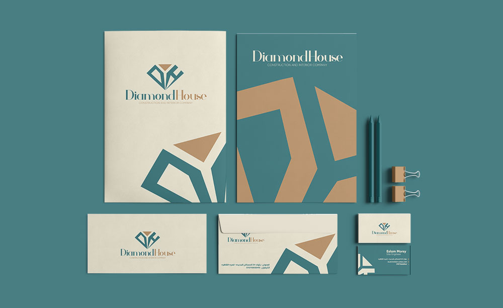
Basically, the logo crystalizes the acronym “DIAMOND ” as it most popular identification label. Also, the design of the outside frame is meant to improve the readability of the full name of the Centre in both the English and the Arabic languages.
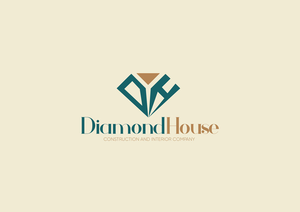
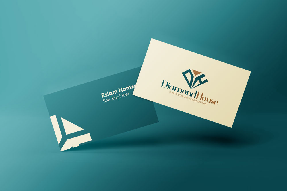
Symbolically, we took the company's first letters to take the shape of the DIAMOND without changing its appearance and keep in mind the symmetry & regarding to the client point of view